What is an SLA reporting dashboard? It is a live view that measures your team against its service level agreements. It helps track key metrics such as response time, resolution time, and compliance, ensuring performance is always visible. When reporting is simple and tied to daily work, such as email replies, SLA performance becomes easier to manage and improve.
An SLA reporting dashboard is a single screen that tracks your service level agreements, live. It pulls your service data into one view. Then it shows whether you are hitting your targets.
Managers get to see live performance, spot breaches early, and act before customers feel the delay.
Most teams already set SLAs. Far fewer can see, at a glance, whether they are meeting them. That gap is where service quietly slips. You cannot hold that line without visibility.
This guide covers what an SLA reporting dashboard is and the metrics to track. It also walks through examples, how to build one, and the tools to use. We will cover the angle most guides miss, too — reporting on email and reply-time SLAs.
An SLA reporting dashboard is a visual tool that reports your performance against service level agreements. It shows whether services meet agreed targets. Think of it as the control panel for every promise you make to customers.
A service level agreement, or SLA, is a commitment to deliver a service at a defined standard. The dashboard presents that commitment as live numbers. Instead of digging through tickets or your inbox, you see compliance and breaches in one place.
An SLA reporting dashboard helps teams focus on the work that has the biggest impact on service performance. Agents can identify overdue requests, while managers can spot potential SLA breaches before they affect customers.
A good dashboard answers three questions at once. Are we meeting our SLAs now? Which items are about to breach? And where is the performance trend heading?
When you have this information in one place, you can identify issues and act on time.
An SLA reporting dashboard works in three steps. It pulls data from your service systems, measures it against your SLA rules, and then visualizes the result. The flow is simple — connect a source, define the targets, and show the gap.
Your data can come from a helpdesk, an ITSM platform, or your inbox. The dashboard applies each rule, such as “respond within one hour.” It then calculates whether you met it. Color coding and alerts also surface anything at risk.
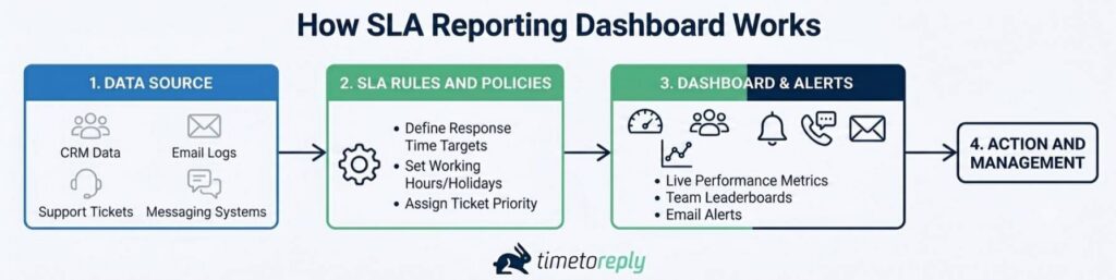
Image via timetoreply
These three terms overlap, but they differ. An SLA reporting dashboard is the live, visual view. An SLA report is a fixed snapshot you share with stakeholders. SLA monitoring is the process of watching performance and triggering alerts.
The easiest way to think about it is in terms of timing. SLA monitoring focuses on preventing breaches before they happen. An SLA reporting dashboard helps teams understand what is happening and what needs attention next. An SLA report looks backward, helping managers and stakeholders evaluate performance over a completed period and identify long-term trends.
Also Read:
An SLA reporting dashboard is important because it provides evidence for operational decisions. A target you cannot track is one you’ll miss. The dashboard closes that loop.
Poor visibility affects service performance. Customers expect quick customer replies, and trust drops with every hour of silence. Slow or missed responses cost businesses customers and revenue. An SLA reporting dashboard exists to prevent exactly that.
Service teams also pay the price for poor SLA visibility. Without clear SLA data, agents may focus on the wrong priorities. Also, managers may not have the information needed to address potential breaches early. A shared SLA reporting dashboard replaces that guesswork with facts.
On top of that, SLA breaches have financial consequences. Every breach can trigger a service credit, lost renewal, or damaged reputation. The impact of response time extends to customer loyalty and contract renewals.
An SLA reporting dashboard presents those risks as early warnings you can act on. Leaders also get the evidence to defend headcount or a process change.
Clear SLA data can drive measurable improvements. For example, Swift Momentum, a timetoreply customer, improved its response time by 300 – 400%. The change came once the team could finally see and coach the numbers. Visibility is what makes that improvement repeatable.
The best SLA reporting dashboards track a focused metric set. The core four are SLA compliance rate, first response time, resolution time, and met versus breached.
Each of these metrics answers a specific question about service health. Together, they show whether you keep your promises.
The goal is not to track every available metric. Just focus on the KPIs that measure performance against your SLA commitments.
A well-designed SLA reporting dashboard organizes those metrics clearly so teams can understand performance and take action.
The table below explains the core SLA KPIs and what each one measures.
| SLA KPI | What it tracks | Why it matters | Example target |
| SLA compliance rate | Percentage of tickets handled within SLA targets | Shows how consistently your team meets service commitments | 90–95% |
| First response time (FRT) | Time taken to send the first response to a customer | Measures responsiveness and customer wait time | Under 1 hour |
| Mean time to resolve (MTTR) | Average time taken to fully resolve an issue | Indicates how efficiently issues are resolved | Within 8 business hours |
| Met vs breached | Number of SLA targets met compared to missed | Highlights overall SLA reliability | 95% met |
| Tickets nearing breach | Open tickets approaching their SLA deadline | Helps teams address risks before a breach occurs | Zero overdue tickets |
| Backlog vs growth | Open ticket volume compared to incoming volume | Reveals workload trends and capacity risks | Backlog stable or decreasing |
| Customer satisfaction (CSAT) | Customer feedback after an interaction is completed | Measures service quality beyond speed metrics | 90% positive |
| Mean time to acknowledge (MTA) | Time taken to acknowledge a new request | Tracks how quickly new issues are recognized | Under 15 minutes |
| Email reply time | Average response time for email inquiries | Measures email support performance against targets | Under 2 hours |
Response and resolution time measure how fast you reply and fix issues. First response time tracks the first reply to a customer. Mean time to resolve tracks the full fix. These are two of the most common customer service metrics used in SLA reporting.
When reviewing these metrics, don’t focus on averages alone. Averages for first response time can look good even when some individual SLAs are missed. The average hides those outliers. That is why you should track both the average and the breach rate together.
When calculating resolution time, exclude periods spent waiting for a customer response. That way, you measure your team’s effort, not the customer’s reply speed. You can also track email response time the same way.
SLA compliance rate is the percentage of commitments you meet on time. It is the headline number on most SLA reporting dashboard tools. For added context, track both met and breached tickets so you can see not just overall performance, but also where targets are being missed.
Two breach reports are worth tracking. Tickets nearing breach show requests that are close to missing their SLA. Also, recently breached shows tickets that already missed their SLA. Use this report to find the cause of each breach and stop the same problems from happening again.
SLA targets often depend on ticket priority. Many support teams use priority levels from P1 to P4. P1 is for critical issues, while P4 is for low-priority requests. Each priority has its own response and resolution target. That is why you should track SLA compliance by priority, not just as one overall number.
Volume and backlog metrics show how much pressure your team is under. Volume tells you how many tickets are coming in. Backlog shows whether your team is keeping up with the workload. If the backlog keeps growing, it could be a sign that SLA breaches are coming.
CSAT is another important metric to track. Fast response times do not matter if customers are unhappy. A customer satisfaction score helps you measure service quality. Track customer service metrics like CSAT alongside your SLA metrics so you can see the full picture.
Email and reply time metrics show how quickly your team responds to customer service emails. Many SLA reporting dashboards miss this part.
But for many support teams, email is the main way they help customers. Shared inboxes need shared mailbox reporting of their own. If your SLA promises a reply within two hours, your dashboard should show whether your team meets that goal.
The right metrics give you a clear view of performance. Track reply time by mailbox, by agent, and by shared inbox. Email analytics from Outlook, Microsoft 365, and Gmail gives you the data you need.
Also Read:
SLA dashboards and reports come in three main types, sorted by who reads them. There are operational dashboards for agents, analytical reports for team leads, and executive reports for leadership. Each type shows the same data at a different altitude.
The table below maps each type of SLA reporting dashboard to its reader, cadence, and metrics.
| Type | Audience | Cadence | Key metrics |
| Operational dashboard | Agents and frontline staff | Live, all day | Live queue, time remaining, nearing breach |
| Analytical report | Team leads and managers | Daily or weekly | Compliance rate, breaches by cause, MTTR |
| Executive report | Leadership and clients | Monthly or quarterly | Compliance trend, average resolution time |
Operational dashboards give agents a live view of their own SLA data. They show what is due, what is at risk, and what to pick up next. A countdown beside each item indicates what needs to be prioritized.
These views update continuously. Most teams use a basic status view and a live work queue to guide daily actions. They often combine this with service desk analytics for deeper trends.
Analytical reports help team leads see why SLAs are met or missed. They don’t focus on live tracking but trends and root causes. Breaking breaches down by agent or priority helps show where the problem is.
Run these reports every week. Review the past week’s breaches, and log a reason for each. That is how teams stop repeating the same misses. Pair them with specific customer service analytics use cases like compliance trends for context.
Executive and client reports present SLA performance in a simple way for people who don’t need full detail. Leaders focus on compliance trends and average resolution time, meanwhile, clients want clear proof that you met your SLA.
For client meetings, a PDF export or shared link works well. A clear monthly report helps build trust. In the end, customer service SLAs monitoring only work if the reporting is clear and reliable.
A good way to understand these dashboards is to see real examples. The three below show how the same idea works for support, email, and logistics teams. Each one tracks different work and gives a quick answer to SLA performance.
A support team can commit to replying within 15 minutes. Its dashboard would show live response time against that target. It also shows the day’s compliance and a table of tickets nearing breach.
An SLA chart tracks the compliance trend across the week. This SLA reporting dashboard example makes a slipping team obvious at a glance. The goal is to hit 80 percent of SLA targets daily, broken down by agent.
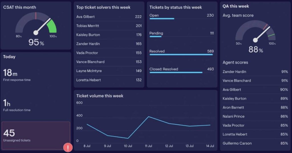
Image via Geckoboard
A customer success team can promise a two-hour reply on inbound emails. Its SLA reporting dashboard will report reply time by mailbox and by agent.
An SLA monitoring chart shows whether each mailbox stays inside the target. It pulls live data from Outlook and Gmail analytics. Because the metrics surface inside the inbox, the team improves without changing how it works. The timetoreply SLA reporting dashboard displays team performance stats against targets.
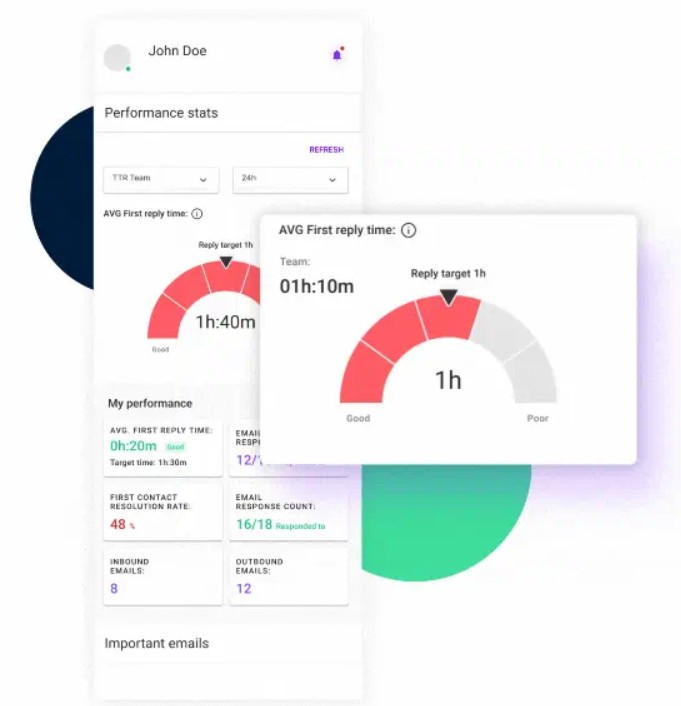
Image via timetoreply
A logistics team answers shipment queries against tight windows. Its SLA reporting dashboard tracks reply times for each client. It also flags accounts that are close to missing their SLA targets.
Email plays a key role in this process, since most shipment updates and exceptions are handled through shared inboxes. That is why email SLAs for logistics are often built directly into the dashboard.
Teams can measure whether agreed response times or targets are being met. Here’s an example of a logistics dashboard showing certain metrics and targets.
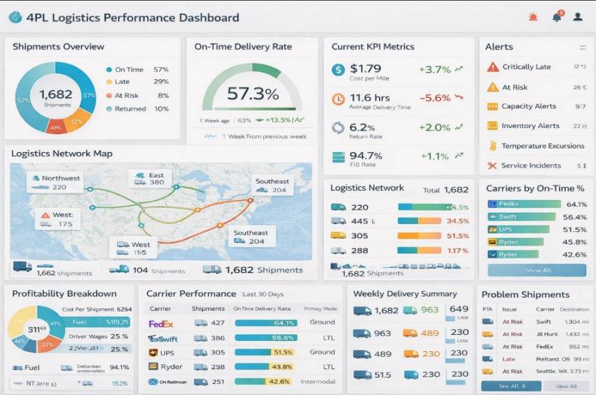
Image via InetSoft
In logistics, consistent and quick replies can improve customer satisfaction and service quality.
Also Read:
You build an SLA reporting dashboard in four steps. Define your SLAs, connect your data, design for clarity, then set alerts. The order matters. Get the targets and data right first, and the visuals become easy.
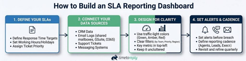
Image via timetoreply
Write down every SLA you promise as a simple statement with a number and a deadline. Then, choose one metric that shows whether you are meeting it. For example, a two-hour reply SLA should use reply time as the main metric.
Set your targets based on your past performance, since very strict goals can lead to failure. As a general guide, most service desks aim for 90 to 95% SLA compliance.
Next, link the systems where the work happens. That may be a helpdesk, an ITSM tool, or your inbox. Pull from every channel that carries an SLA, or your report will have blind spots. For email SLAs, connect Outlook and o365 or Gmail, plus any shared mailboxes.
Keep your SLA reporting dashboard simple to scan through. Use traffic-light color coding — green, amber, and red to show status. Add filters for team, priority, and region so users can focus on what they need.
Put the most-watched metric at the top left, where it is seen first. Avoid adding too many widgets to avoid it being cluttered.
Finally, set alerts that fire before a breach, not after. That gives the team time to save the ticket. Then agree on a cadence — live for agents, weekly for leads, monthly for executives. Use it to improve email response times and refine your targets over time.
Revisit the SLA reporting dashboard each quarter. SLAs, volumes, and teams change, and your dashboard should keep pace.
SLA reporting tools fall under a few categories. They span business intelligence, support dashboards, ITSM platforms, custom builders, spreadsheets, and email-SLA software. The right one depends on where your SLA data lives. The table below maps the landscape.
| Category | Example tools | Best for | SLA data source |
| Business intelligence | Power BI, Tableau | Custom, blended reporting | Any database or export |
| Support and customer experience (CX) dashboards | Geckoboard, Zendesk | Live support team views | Helpdesk and CX tools |
| ITSM platforms | ServiceNow, Jira Service Management | IT incident and request SLAs | Native ITSM data |
| Custom and low-code | Retool, Appsmith | Tailored, build-it-yourself apps | APIs and databases |
| Spreadsheets | Excel, Google Sheets | Small teams and quick starts | Manual or exported data |
| Email and reply-time SLA | timetoreply | Email response-time SLAs | Outlook, o365, and Gmail |
A Power BI SLA dashboard suits teams that blend many sources. ITSM platforms work well when your SLAs sit on IT tickets. Spreadsheets are fine for a quick start, though they rarely update live. A lightweight SLA tracker in a spreadsheet still beats no visibility at all. For email-first teams, email analytics software reports reply-time SLAs out of the box.
For email response-time SLAs, a dedicated tool earns its place. For example, timetoreply tracks inbound email response time across Outlook, o365, and Gmail. It needs no change to your team’s workflow. It reads metadata only, and it is SOC 2 Type II and ISO 27001 certified.
Want to see it in your own inboxes? You can book a demo for a short tour.
Also Read:
SLA reporting works when it is built on clear targets, useful signals, and a simple dashboard layout. Start by measuring real performance before you set any goals. This helps you avoid targets that look good on paper but fail in practice.
Here are some best practices to follow for effective SLA reporting:
1. What is an SLA reporting dashboard?
An SLA reporting dashboard is a live view of your performance against service level agreements. It pulls data from your service systems and compares it to your targets. It also shows compliance, response and resolution times, and breaches.
2. What are the 4 types of SLA reporting dashboards?
SLA dashboards are best grouped by audience and purpose. The main types are operational dashboards for agents and analytical reports for team leads. There are also executive summaries for leadership and client-facing reports for customers. Operational views update live. Analytical reports show trends and causes, while executive reports give a clean compliance summary.
3. What is SLA P1, P2, P3, P4?
P1 to P4 are priority levels that set different SLA targets by severity. P1 is a critical issue, like a full outage, with the fastest targets. P2 is high impact, and P3 is moderate. P4 is a minor request with the most relaxed targets. Your dashboard should report SLA compliance for each level separately.
4. What metrics should an SLA reporting dashboard track?
An SLA dashboard should track SLA compliance rate, first response time, and mean time to resolve. Also, add the split between met and breached commitments. Include tickets nearing breach for early warning and backlog versus growth for capacity. Add CSAT for quality. For email teams, include reply time per mailbox and agent.
5. What is a good SLA compliance rate?
Most teams target between 90 – 95% SLA compliance. High-maturity teams push past 95%.The right number depends on your service and resources. So, set it from your own historical performance, not a generic figure. The main focus should be a steady target you can maintain. Then improve it over time using clear tracking on your SLA reporting dashboard.
6. How do you build an SLA reporting dashboard in Power BI or Excel?
To build an SLA reporting dashboard in Power BI or Excel, first define your SLAs. Pick the metric that proves each one. Then, connect or import your data and add calculations for compliance and response time. Build clear charts that show performance at a glance, and use traffic-light colors to highlight status. Power BI is better for live, real-time data, while Excel works well for smaller or quick setups.
7. What is the difference between an SLA dashboard and SLA monitoring?
An SLA reporting dashboard is the live, visual view of your performance against targets. SLA monitoring is the process behind it. Monitoring watches performance, applies the rules, and triggers alerts when a breach is near. In short, monitoring is the engine. The dashboard is the screen that makes the results easy to read and act on.
8. How do you measure and report email response-time SLAs?
You measure email response-time SLAs by tracking how long each email takes to get a reply and comparing it to your set target. You can report the results by mailbox, agent, and shared inbox to see where delays happen. Connect your email analytics to Outlook, o365, or Gmail so the data is captured automatically. A dedicated email-SLA tool surfaces these metrics live.
9. How often should you report on SLAs?
SLA reporting should run on different rhythms for different users. Agents need a live dashboard to manage daily work. Team leads need weekly reports to review breaches and causes. Leadership and clients need monthly or quarterly summaries to track trends. Matching the cadence to each group helps keep reporting useful.
10. What is the difference between an SLA and a KPI?
An SLA is a commitment to a service standard, often written into a contract. A KPI is a metric you track to gauge performance. Every SLA is measured by one or more KPIs. But not every KPI is tied to an SLA. On a dashboard, the SLA is the promise and the KPI is the proof.
Also Read:
An SLA reporting dashboard displays service level agreements as clear, real-time numbers your team can act on. For effective reporting, start by defining the SLAs that matter, then track the metrics that show if you are meeting them.
Share the right view with each audience so everyone gets the information they need. When this is done well, SLA breaches become easier to spot and prevent.
Most of the real impact comes from small, daily work like email replies. These are often the first thing customers notice, and they shape how reliable your service feels.
When you measure performance where the work actually happens, teams do not need extra effort to improve — they just see the gaps and close them. Over time, that steady visibility builds stronger habits and improved customer service.
Ready to see your email reply-time SLAs in real time? Book a demo and see how timetoreply helps you track and improve response performance.
Get live inbox alerts and reply quickly to customer emails with timetoreply

Head of Customer Success @ timetoreply
Barry Blassoples is the Head of Customer Success at timetoreply, where he helps customer-facing teams boost revenue and protect brand reputation by providing actionable insights to improve their business email response times. He has over 15 years of leadership experience across customer success, sales, and marketing roles in high-growth tech companies.


Trusted by high-performing inbound sales teams and customer-facing teams globally.
Close more deals and delight more customers with the faster, smarter, deeper email analytics and performance optimization software that works straight from your team’s inbox.