When someone clicks on your ad or email and lands on your site, you’ve already spent money to get them there. If they leave without buying, signing up, or requesting a demo, that money is wasted.
The problem is that most brands focus on getting more visitors instead of getting more out of the visitors that land on their website. As a result, they burn through ad budgets without seeing real growth in sales.
The truth is, traffic alone doesn’t grow a business; conversions do. Learning how to increase your conversion rate is what turns passive visitors into paying customers and directly compounds your revenue.
In this article, we’ll break down why increasing conversion rate matters. You’ll also learn how to increase your conversion rate with effective strategies. We’ll walk through each practical step so you can apply them and consistently grow your business.
Typically, the average conversion rate is 2.9%. That means out of every 10,000 website visitors, 290 are taking action. Increasing conversions is an important factor that affects sales and business productivity.
Even a one percent lift in conversions can mean thousands of dollars in additional monthly revenue. Here are some key benefits of increasing conversion rate:
Now that you know the benefits, understanding how to increase your conversion rate is one of the most important foundations to grow your business. Let’s take a look at 19 strategies that can help you get there.
These strategies offer practical ways to improve your website’s conversion performance. Each focuses on elements that shape user experience and decision-making.
Your Unique Value Proposition (UVP) is the first thing visitors notice when they land on your site. If it’s unclear, you’re losing conversions before the customer journey starts. That’s why optimizing it is crucial when learning how to increase your conversion rate.
Your UVP should be specific and benefit-focused. Don’t just say, “We offer the best service.” Instead, show the real, tangible benefit: “Save 30% on your energy bill with our smart thermostat.” Statements like this tell visitors exactly what they’ll gain, making them more likely to take action.
Additionally, highlight what makes your offering different. Something like, “Our platform integrates seamlessly with over 50 third-party apps” instantly shows what sets your product apart. This gives visitors a reason to choose you over others.
Placement also matters. Display your UVP prominently on your landing page — ideally above the fold, near your main CTA — so it can engage customers immediately. If it’s buried or requires scrolling, many will leave without converting.
Your UVP should be scannable and easy to understand in five to ten seconds. Regularly test different versions, adjusting wording, tone, placement, font size, or visuals, to see what resonates most. Small refinements can lead to significant improvements when figuring out how to increase your conversion rate.
This is one of the most important strategies when learning how to increase your conversion rate.
When writing your CTAs, consider using specific verbs that tell the visitor exactly what to do, such as “sign up free.” Emphasize the benefits they’ll gain from taking that action. This clarity makes them far more likely to convert.
You can also create a sense of FOMO to drive quicker action with phrases like “limited time offer.” Pair these with high-contrast colors to make buttons stand out and easier to click.
That said, your CTA should still match the rest of the page. Imagine landing on a page with a compelling headline and hero image, but the CTA doesn’t match the website’s font or style. This inconsistency can discourage users from clicking altogether.
It’s also important to have white space surrounding your CTA. This naturally draws the user’s eye to it.
For instance, Death Wish Coffee’s CTAs work because they remove uncertainty and make the next step obvious. Each button tells you exactly what will happen when you click (“Shop All Coffee,” “Shop Maple Cinnamon”), which reduces hesitation:
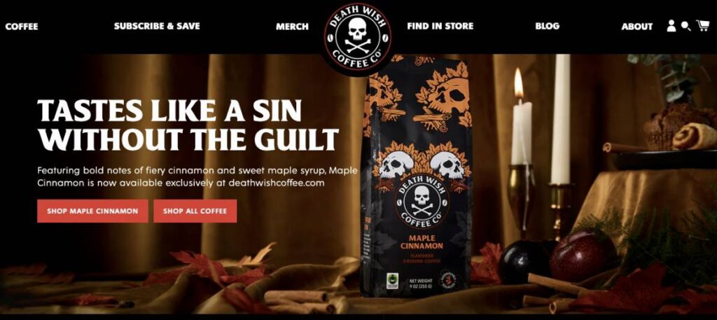
Image via Death Wish Coffee Co.
Placing CTAs above the fold and using visual contrast ensures they’re seen instantly, while consistent branding builds trust.
Beyond clear language, color, and placement, personalizing CTAs is an effective step when learning how to increase your conversion rate.
In fact, personalized CTAs perform 202% better than basic ones. Tailor the wording based on visitor source, behavior, or buying stage to drive stronger engagement.
Even the best-designed websites can have areas that slow users down or make them hesitate. Identifying these small friction points is crucial if you want to understand how to increase your conversion rate effectively.
Start by looking at your content friction. Ask yourself: Are headings clear? Is your copy concise and easy to read? Confusing or dense language can make even interested visitors hesitate, lowering the chance of meaningful customer engagement or action.
Next, consider FAQ and help friction. FAQs are meant to support users, but if they’re overwhelming or hard to read, they can frustrate rather than assist.
You’ll also want to watch for technical friction. Broken links, images that fail to load, or content that doesn’t display properly on certain devices may seem minor, but they subtly reduce trust and hurt conversions.
Here are some steps to help fix these friction points when learning how to increase your conversion rate:
Also Read:
Visuals are often the first thing users process. That’s why every image, video, or animation on your page should work for your conversion goals. This principle is key when exploring how to increase your conversion rate successfully.
Start with quality and relevance. Use crisp, high-resolution visuals that reflect your product’s real-world experience.
For example, instead of static product images, show it in action — a short demo video, lifestyle photo, or even a 360-degree or AR preview. This builds trust and reduces uncertainty, especially among high-intent shoppers.
Next, structure your visuals intentionally. Visual hierarchy and directional cues guide users’ attention toward key conversion elements.
For example, if a person in your hero image is looking towards your call-to-action button, users subconsciously follow that gaze. Designers call this gaze direction, and it’s one of the most effective ways to draw attention when learning how to increase your conversion rate.
Rhode Skin demonstrates this well. Their homepage features a model using their peptide de-puffing eye patches, clearly showing the product in action. The image demonstrates real-world use and directs attention toward the waitlist CTA:

Image via rhode
Your landing page has one job: Guide visitors toward a specific action. Every element must serve that goal, so ensure nothing distracts from your main offer.
Each extra link, button, or reference that doesn’t drive visitors toward your primary CTA is an opportunity lost. Even subtle diversions like sidebar links, multiple banners, or a cluttered footer can dilute focus and lower your website’s conversion rate.
When auditing your landing pages, remove anything that doesn’t support your main goal.
Ask yourself: Does this element push the visitor closer to completing the conversion? If not, it doesn’t belong. This simple yet powerful approach can help you learn how to increase your conversion rate effectively.
Additionally, limit navigation menu items to only what’s essential for the customer’s experience and journey.
For instance, if your conversion goal is a sign-up, minimize links to other pages (like blog, about, or shop). This keeps users focused and moving toward completing the desired action.
If you’re interested in how to increase your conversion rate, social proof is one of the most powerful tools available. Simply put, people trust the experiences of others. If someone else had a great outcome, new visitors are more likely to follow their lead.
Displaying customer reviews, testimonials, user-generated content, or trust badges adds credibility and reduces hesitation. However, relevance matters just as much as volume. When adding social proof, ensure it supports the page’s purpose:
Placement plays a major role, too. Star ratings or reviews should appear above the fold, while trust badges and certifications work best near checkout or sign-up forms.
Authentic customer reviews and quotes build credibility, making them a proven way to master how to increase your conversion rate successfully.
For example, Kajabi builds instant trust by displaying “5/5 from 1.6K+ creators” prominently on its homepage. This clear, data-backed proof reassures visitors that real users already love the platform:
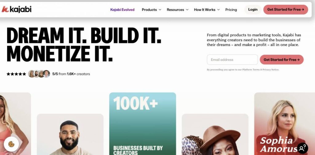
Image via Kajabi
Page speed is critical when learning how to increase your conversion rate. In fact, users are more likely to bounce from pages that take longer than three seconds to load.
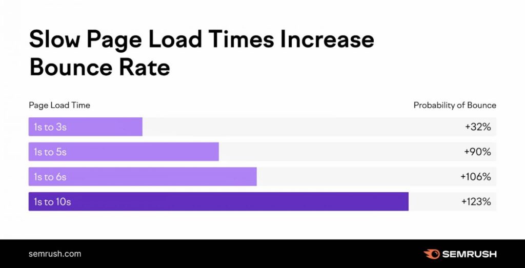
Image via Semrush
Slow sites frustrate visitors and waste valuable opportunities.
Imagine 100 visitors landing on your product page. If it takes more than five seconds to load, most will leave before even seeing your offer. That’s potential revenue lost — without any fault in your offer or messaging.
To fix this, check your current load times using tools like Google PageSpeed Insights or GTmetrix. Look for images and mobile pages that load slowly. Often, compressing images and using a content delivery network (CDN) can significantly improve speed.
Be sure to apply these changes across all devices, especially mobile.
Also Read:
When visitors land on your site, they should know instantly where to go. Confusing menus, hidden search bars, or too many options create decision fatigue, quietly killing conversions.
In fact, 80% of shoppers will leave if their search experience is poor.
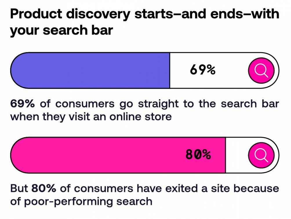
Image via Nosto
The solution? Keep your menus clear and logical. Group pages into intuitive categories so users never have to guess where to click. Internal links should gently guide visitors toward your conversion goals without overwhelming them.
Your search feature should be prominent, fast, and responsive. Filters and sorting options should be straightforward and easy to use, especially for ecommerce websites with large catalogs. A frustrating search experience means lost customers and revenue.
To avoid decision fatigue, present fewer, well-structured options instead of overwhelming visitors with everything at once.
A clean “Shop by Category” menu, for instance, or a simple filter system can make choices feel manageable. This ensures your customers have a good experience on your site.
According to Statista, mobile commerce was projected to hit $2.5 trillion in 2025, accounting for 63% of total retail ecommerce.
So, if most of your traffic comes from smartphones, which it likely does, a poor mobile experience can drastically reduce conversions. Therefore, understanding how to increase your conversion rate on mobile is essential for success.
A mobile-first approach means designing for the smallest screen first, then scaling up. Place your most important CTAs and product highlights in the first screenview, use responsive layouts, and ensure buttons are large enough for effortless tapping.
Focus on thumb-friendly interaction. You want to position buttons within natural thumb zones and make them wide enough to prevent accidental clicks. Use contrasting colors and ample whitespace to separate key actions.
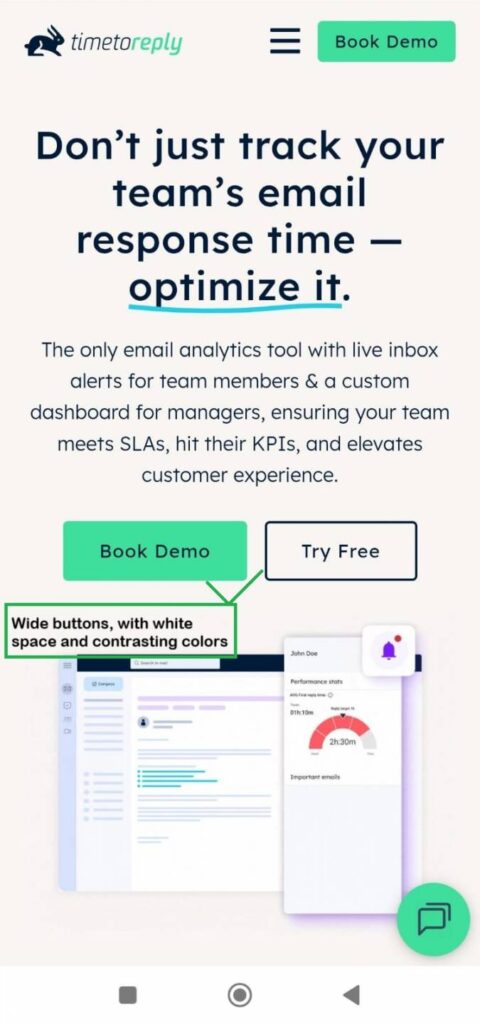
Image via timetoreply
Readability also plays a huge role when navigating how to increase your conversion rate on mobile sites.
Use a clear font (at least 16px), short and scannable sentences, and optimized visuals that load quickly without becoming blurry. Every unnecessary word or oversized image increases scroll time and forces mobile users to think longer, which hurts conversions.
Once you’ve done that, test your site like real users would — on smaller screens, sometimes slower internet, or one-handed scrolling.
Use tools like Google’s Mobile-Friendly Test and Hotjar’s mobile heatmaps to see where users hesitate, mis-tap, or drop off. These insights make it easier to improve mobile performance as you master how to increase your conversion rate.
If you’ve ever changed a headline, CTA, or layout, hoping it magically improves online sales, you’ve experienced the frustration of guessing.
A/B testing eliminates that guesswork by showing what truly drives results — based on real user behavior, not assumptions. It’s one of the most reliable methods for learning how to increase your conversion rate.
Here’s a step-by-step process you can follow:
Analytics reveal what users do, but customer feedback explains why they do it. That “why” is invaluable when diving into how to increase your conversion rate effectively.
Start by adding on-page surveys with focused, open-ended questions like:
Even a single well-placed question can uncover friction points you’d never catch in a heatmap.
You can also include exit-intent surveys. These are triggered when someone’s about to leave your site. If multiple users say, “I couldn’t find your return policy,” that’s a clear signal to make it more visible.
Post-purchase surveys are equally valuable. Ask new customers what convinced them to buy — or what almost made them back out. If 60% mention a free shipping incentive as the final push, you know exactly what to emphasize in future campaigns.
Just make sure your surveys and pop-ups don’t disrupt the browsing experience. Consider a full-screen survey that appears right after someone adds an item to the cart. It will frustrate users.
Instead, trigger surveys subtly, like after checkout. You could display a short survey on the order confirmation page, for instance, asking questions like “What was the best part of your purchasing experience?”
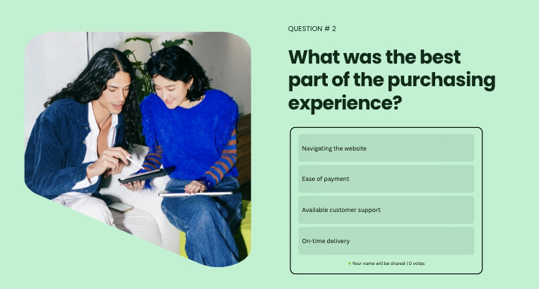
Image via Canva
Speed matters just as much as collecting feedback. When customers take the time to share concerns or questions via email, responding quickly shows you value their input and builds trust.
Tools like timetoreply help teams respond faster to feedback emails by tracking response times and alerting team members when replies are at risk. This ensures no customer feedback goes unaddressed, improving satisfaction and conversion potential.
Also Read:
AI chatbots can act as conversion catalysts. When built for your business, they guide visitors and surface insights you can use when exploring how to increase your conversion rate.
Chatbots engage users in real time. They answer questions, recommend products, or nudge visitors toward checkout.
If someone lingers on your pricing page, a chatbot could pop up and ask, “Would you like to see how our plan compares to competitors?” That micro-interaction can keep them from leaving. Here’s how it works:
For best results, ensure chatbot interactions integrate with your CRM and analytics tools, so each conversation contributes to the full customer journey.
And when a conversation is escalated to a live rep, tools like timetoreply can help teams respond instantly to hot leads. This prevents lost sales opportunities and maintains engagement momentum.
Not every visitor lands on your site for the same reason. Segmentation lets you tailor messaging based on who’s visiting, where they came from, and what actions they’ve taken before. It’s one of the most effective ways to increase your conversion rate.
For instance:
You can segment website visitors based on:
Always tie these insights to specific objectives such as increasing sign-ups, lowering bounce rates, or meeting customer satisfaction goals. When mapping out how to increase your conversion rate successfully, keep testing and refining based on how each segment behaves.
To know how to increase your conversion rate effectively, you need to analyze website data. Start by tracking which pages, products, or campaigns lead to visitors taking actions. Use tools like Google Analytics to gather actionable insights on:
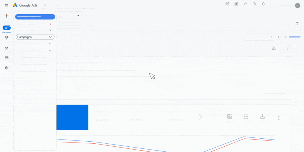
Image via Google
For example, you might notice that one product page converts much better on mobile than desktop. Knowing this, you could optimize your desktop experience to match what’s working on mobile.
Checkout complexity is a major reason shoppers abandon their carts. The average checkout form has about five steps. These include reviewing the cart, entering shipping info, adding payment details, and confirming the order.
It also requires users to fill out around 11 fields, such as name, address, and credit card information.
The key insight here is that the number of fields matters more than the number of steps. Even a short, three-step checkout can feel overwhelming if each step has too many fields. Because of this, 18% of users leave without completing their purchase.
Fewer fields make the process feel faster and simpler for users. Here are some ways to optimize your checkout flow when navigating how to increase your conversion rate:
For example, Glossier’s checkout page demonstrates a user-friendly flow.
It starts with express checkout options, then collects contact information and shipping details. It even asks customers if they’d like a free gift. This incentive is worth adding to your form when learning how to increase your conversion rate successfully.
After entering payment details and optionally choosing to save all their information for future purchases, users reach the Place Order CTA:
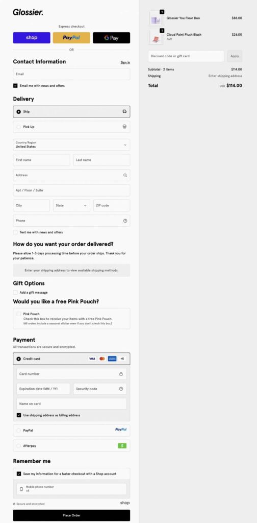
Image via Glossier
Also Read:
When exploring how to increase your conversion rate, remember that pop-ups work best when they guide, not interrupt, the user experience. Their role is to capture attention, reduce abandonment, and encourage action at the right moment.
For instance, an exit-intent pop-up might appear when a visitor is about to leave a product page, offering a 10% discount or a free guide. Sometimes, that final nudge is enough to turn hesitation into a purchase.
A scroll-based pop-up could appear after a reader has scrolled halfway down a website, inviting them to subscribe to a newsletter or download a resource. This way, it catches them when they’re already engaged.
Personalization can make these pop-ups even more effective. Returning visitors might see a reminder of items left in their cart, while first-time visitors could be offered a welcome incentive.
Lead capture pop-ups and special offers, like free shipping or limited-time deals, help collect contact info while encouraging users toward action.
For example, Everlane offers a 20% off first orders in exchange for customers’ emails. This type of pop-up captures attention early, builds your subscriber list, and provides a strong nudge toward completing a first purchase:
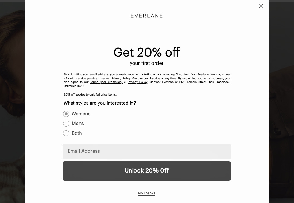
Image via Everlane
Done right, pop-ups not only boost engagement but drive sales — making them invaluable when focusing on how to increase your conversion rate.
Upsells encourage customers to upgrade to higher-value products during the purchase process. For example, when a shopper selects a laptop, offering a model with more storage or premium features can increase the total sale.
Cross-sells, on the other hand, suggest complementary items, like a laptop bag, mouse, or software subscription, either during checkout or immediately after purchase.
To illustrate, Chubbies uses a post-add-to-cart pop-up to recommend related products.
After adding the Juniper Jumper hoodie to your cart, a pop-up appears with items ‘Recommended for You.’ Along with it are options to continue shopping or proceed to checkout. This boosts your average order value without disrupting the purchase flow:
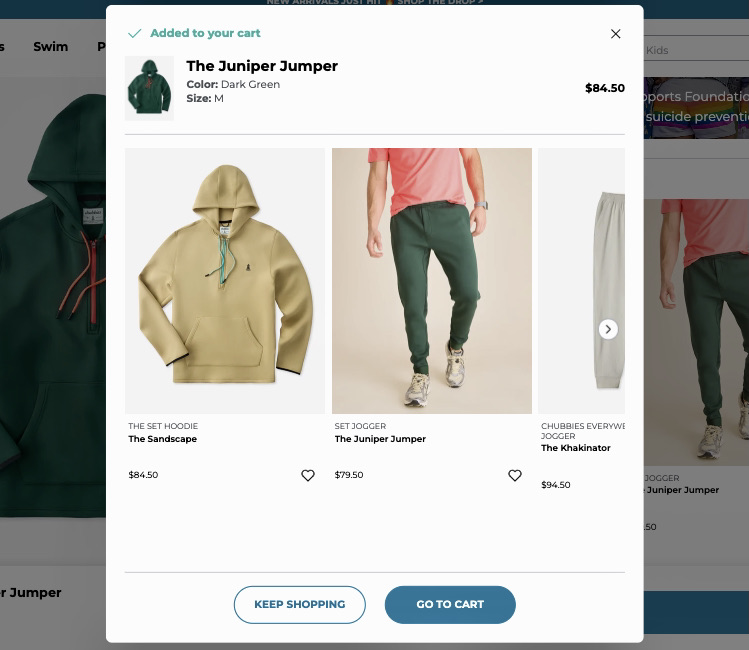
Image via Chubbies
Bundles and order bumps are another effective strategy to implement when learning how to increase your conversion rate. Bundling products together at a discount or offering small add-ons at checkout provides extra value without feeling pushy.
The key is timing and relevance. An offer only works if it feels useful and tailored to the shopper’s current needs.
Additionally, personalization makes upsells and cross-sells even more effective. You can use customer analytics, browsing history, past purchases, or behavior on the site to suggest products that truly resonate with the visitor.
Cart abandonment can be a major challenge for businesses. In the US, nearly 40% of shoppers abandon purchases due to extra costs like shipping, taxes, or fees. Mobile abandonment is even higher, reaching 84% in previous years.
About 70% of shoppers value free shipping, and 60% prioritize fast delivery. These insights highlight the potential to turn near-conversions into completed purchases by adding cart abandonment emails to your email marketing strategy.
The first thing to consider is timing. Send the first email within a few hours of abandonment, followed by another after one to three days as a gentle reminder.
Personalize emails with the customer’s name, the items left in their cart, and messaging that reflects their browsing or purchase history. Including incentives — like discounts, free shipping, or limited-time bonuses — can further encourage hesitant buyers.
Social proof also works well. Reviews, ratings, and customer testimonials reassure potential customers and create urgency. Ensure your CTA is clear and compelling, and optimize emails for mobile for a smooth experience.
To ensure timely follow-up, tools like timetoreply can help you track email response times and provide alerts when follow-ups are at risk. This helps you act quickly, before interest fades and prospects slip through the cracks.
By implementing these strategies thoughtfully, you can recover lost sales while mastering how to increase your conversion rate and enhance customer satisfaction.
For instance, Brew Tea Co. uses a friendly and conversational tone in its abandoned cart email. There’s free shipping on orders over £20, same-day dispatch if ordered before 5 PM, and a referral bonus.
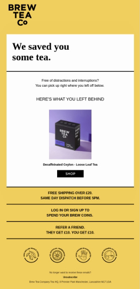
Image via Really Good Emails
This mix of urgency and personalization is a great example of how to increase your conversion rate.
Not every visitor converts on their first visit, but that doesn’t mean the opportunity is lost. Retargeting campaigns focus on visitors who showed interest but didn’t complete an action on your website, giving you a second chance to guide them back.
For successful retargeting and email marketing campaigns, smart segmentation is crucial. Tailor your messaging to where users dropped off in the journey.
For example, product page browsers may need more product education, while cart abandoners may respond better to reminders or limited-time offers.
When learning how to increase your conversion rate with retargeting, focus on:
Dynamic product ads are especially effective. They automatically display the exact products shoppers viewed or added to their cart earlier.
Consider someone who browses a pair of Nike sneakers without buying. They might later see an ad featuring those same or similar sneakers, reminding them to complete the purchase.
Also Read:
1. How long does it take to see results after optimizing your conversion rate?
When you start applying strategies on how to increase your conversion rate, keep in mind that results don’t appear overnight. Some sites begin to see improvement within days while others take weeks, depending on traffic volume and the scope of changes tested.
2. Which conversion strategies should I prioritize if my site has low traffic or limited resources?
Focus on high-impact, low-effort strategies. Improve clarity by making your value proposition obvious, simplifying navigation, and strengthening CTAs.
Use qualitative research, such as session recordings or surveys, to understand friction points and find where users hesitate. Even minor mobile optimizations can yield meaningful gains when learning how to increase your conversion rate.
3. How do broken links or poor mobile performance hurt conversions?
Broken links signal poor site maintenance and interrupt the buying process—most users won’t try again. Poor mobile performance, like tiny text or shifting layouts, frustrates users and makes it hard to complete key actions.
Since mobile traffic dominates, these issues directly reduce trust and conversions. Fixing them is essential when learning how to increase your conversion rate successfully.
4. How can ecommerce sites specifically improve their conversion rates?
If you’re an ecommerce marketer still learning how to increase your conversion rate, start with a strong product presentation. Use high-quality visuals, write detailed yet scannable descriptions, and display trust signals like reviews, shipping policies, and guarantees.
Offering multiple payment options and an easy checkout process also minimizes hesitation, reduces cart abandonment, and helps improve ecommerce conversion rates.
5. What’s the role of AI and personalization in boosting conversions in 2026?
AI and personalization drive conversions through real-time, one-to-one experiences across web, app, and ads. Predictive analytics help anticipate customer needs, personalize offers, and optimize layouts instantly.
AI also automates A/B testing and ad spend to boost ROI, while chatbots guide customers towards relevant action.
6. Why is my conversion rate so low?
Low conversion rates often stem from unclear value propositions, confusing navigation, slow page speeds, or friction in the checkout process. Your site may lack trust signals or your CTAs might not be compelling enough.
Check analytics to identify drop-off points and use heatmaps or surveys to understand user hesitation. Even minor usability or content clarity fixes can significantly raise conversion performance.
7. What’s the best way to test conversion improvements?
A/B testing is the most reliable method. Start with a clear hypothesis, test one variable at a time, and run the experiment long enough to gather valid data.
Use tools like Google Optimize or VWO, and track metrics like bounce rate, scroll depth, and conversions to see what works.
8. What’s the difference between conversion rate and conversion rate optimization?
Conversion rate is the percentage of visitors who complete a desired action on your site. Conversion rate optimization (CRO) is the process of improving that percentage through testing, analyzing user behavior, and implementing changes.
CRO involves strategies like A/B testing, improving UVPs, and reducing friction to increase conversions over time.
Learning how to increase your conversion rate effectively can feel overwhelming since it involves design, data, and user behavior.
But proven strategies can help.
Start by auditing your website and optimizing your UVP, visuals, CTAs, and mobile experience. Build trust with testimonials, reduce friction in checkout, and personalize user journeys.
Timely email responses matter too. Tools like timetoreply help you follow up faster on feedback and abandoned carts, ensuring no opportunity slips through.
Try timetoreply to stay responsive and conversion-focused.
Get live inbox alerts and reply quickly to customer emails with timetoreply