
The strongest signals can come from product usage, billing behavior, and service performance. Changes in these areas can give your team warning before a customer reaches renewal.
There’s a real cost to missing those signals, as shown in PwC’s 2025 Customer Experience Survey. It found that 29% of US customers stop buying from brands after a poor customer experience.
This guide covers the full churn prediction process. You’ll learn how to build the right data set, choose a model, measure accuracy, and act on the results.
Churn prediction estimates which customers are likely to leave within a specific period. It uses past customer behavior to score current accounts and identify those at higher risk.
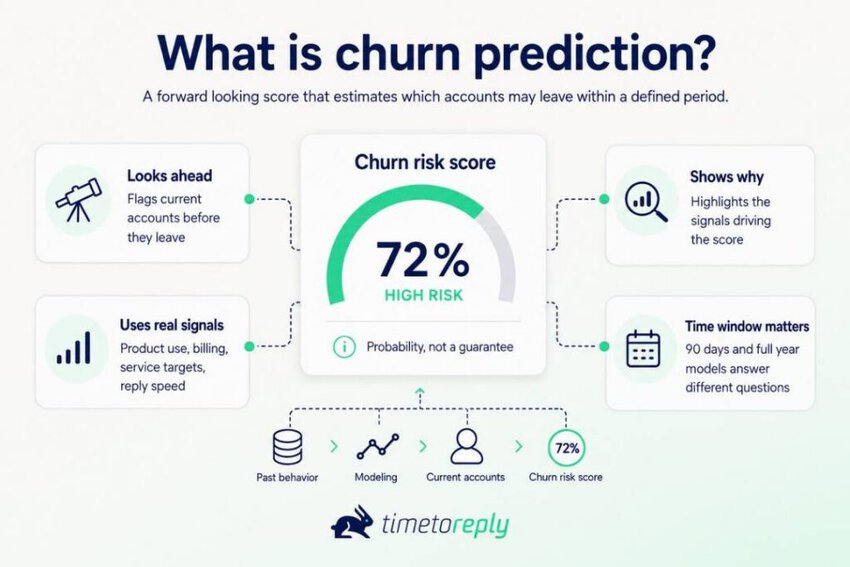
The score is a probability, not a promise that the customer will leave. A useful model should also show which signals caused the risk score to rise.
Those signals can include lower product use, billing changes, missed service targets, or slower replies. This gives your team more context than a simple list of customers who might churn.
Churn prediction looks forward at current accounts, rather than describing past losses. That makes it useful for deciding which customers need attention before they leave.
The window matters as much as the score. A model built for 90 days answers a different question from one built for a full contract year.
Also Read:
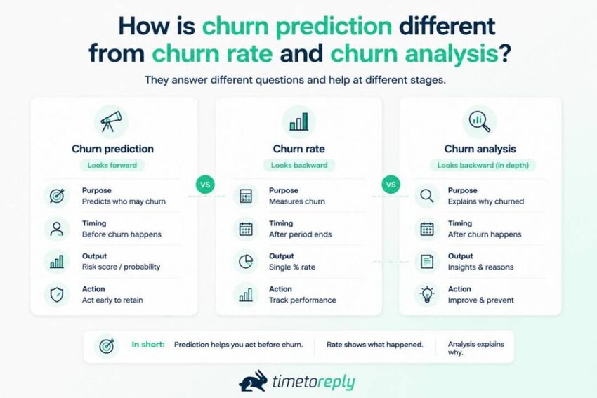
Churn rate tells you how many customers you lost, while churn analysis tells you why. Churn prediction looks ahead and estimates which individual accounts are most likely to leave.
So, the three terms aren’t interchangeable. One measures the past, one explains the past, and one helps your team prepare for what may happen next.
Here’s a quick side-by-side comparison.
| Term | What it answers | How it’s normally reported | What you get |
| Churn rate | How many customers left | One percentage for a past period | A trend for the business |
| Churn prediction | How likely this account is to leave | One score per account for a set period | A ranked list to act on |
| Churn analysis | Why customers left | A study of accounts that already churned | Themes to improve |
The practical difference is what your team can do with the result. Churn rate tells leadership what happened, but it can’t tell an account owner who needs a call today.
Qualtrics XM Institute’s 2025 study found 34% of surveyed consumers reduced spending after a negative experience, while 13% stopped spending entirely.
So, if you see such patterns emerge, you can predict churn early and take preemptive action to stop it.
Churn rate measures past customer losses, while churn analysis looks for patterns behind those losses. Churn prediction looks ahead and gives each current account a risk score for a set period.
Support and CS teams can use churn scores to rank accounts, find service risks, and decide when to act. This gives teams a clearer way to use limited time across a large customer base.
That changes how teams spend their time each week. They can focus on higher-risk accounts, connect service issues to revenue risk, and step in before renewal.
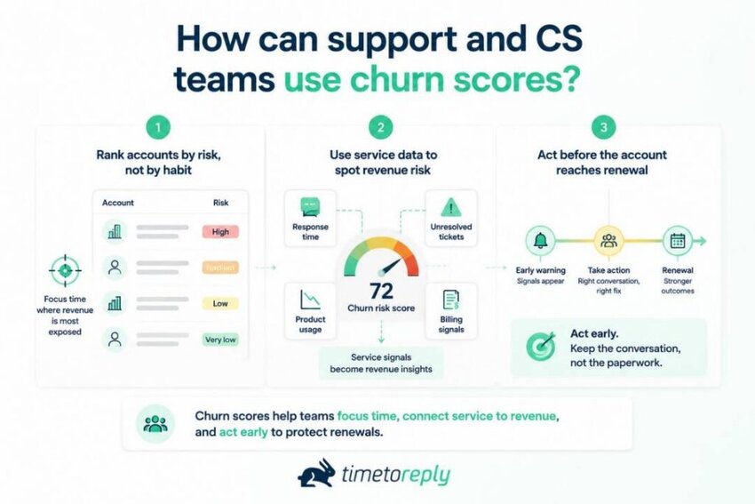
Risk ranking gives your team a triage rule it can use from week to week. Capacity is finite, so all accounts can’t receive equal attention. The score helps direct your team’s time toward the accounts where the revenue is most exposed.
Ranked risk is also better than working through accounts in chronological order. It keeps the loudest customer from taking priority over a quiet account that may be closer to leaving. If you track customer service challenges by account, you already have much of the raw material.
A slow reply is usually just another service metric. Add that data to churn prediction, though, and it can tell you something about an account’s revenue risk. The report stops being only about team performance and starts showing which customers may need attention.
There’s a reason to take those signals seriously. Zendesk’s 2026 CX Trends Report found that 85% of surveyed CX leaders say one unresolved issue is enough to lose a customer.
The wider retention numbers aren’t great either. Benchmarkit’s 2025 B2B SaaS benchmarks show gross revenue retention falling from 90% to 88% over three years. Benchmarkit adds that participant selection bias could explain the decline.
SaaS Capital’s 2025 study shows why contract value matters here. Median net revenue retention is 102% for companies with annual contract values between $25,000 and $50,000. That’s not much room for accounts that are already at risk.
So every hour matters when your team has limited time. Churn prediction can help put that time behind the accounts most worth saving. The same playbook that helps you increase conversion rate can also help when you’re working on renewals.
Churn prediction shortens the gap between a warning sign appearing and someone acting on it. Many churn signals show up before the customer has made a final decision, but teams may not notice them in time. A churn score pushes those accounts forward instead of waiting for someone to spot the problem.
Speed matters here, especially when service is part of the risk. The first reply can shape the rest of the customer experience, which is why response time and satisfaction matter together.
The score can also point your team toward the right type of save. A billing signal may need a commercial conversation, while a service signal may need an operational fix. That’s where how to improve customer service becomes relevant.
Catch a seat reduction in week one, and you still have a conversation. Wait until renewal, and you may be dealing with paperwork instead.
They can use the scores to move risky accounts up the queue and act before renewal. Earlier action gives teams more time to fix service issues or address commercial concerns.
Also Read:
Churn prediction works by learning from customers who have already left. You label that history, turn customer activity into useful signals, and train a model on those patterns. The model then uses what it learned to score your current customers.
The quality of those labels matters more than choosing the fanciest model. The five steps below show how the process works from start to finish.
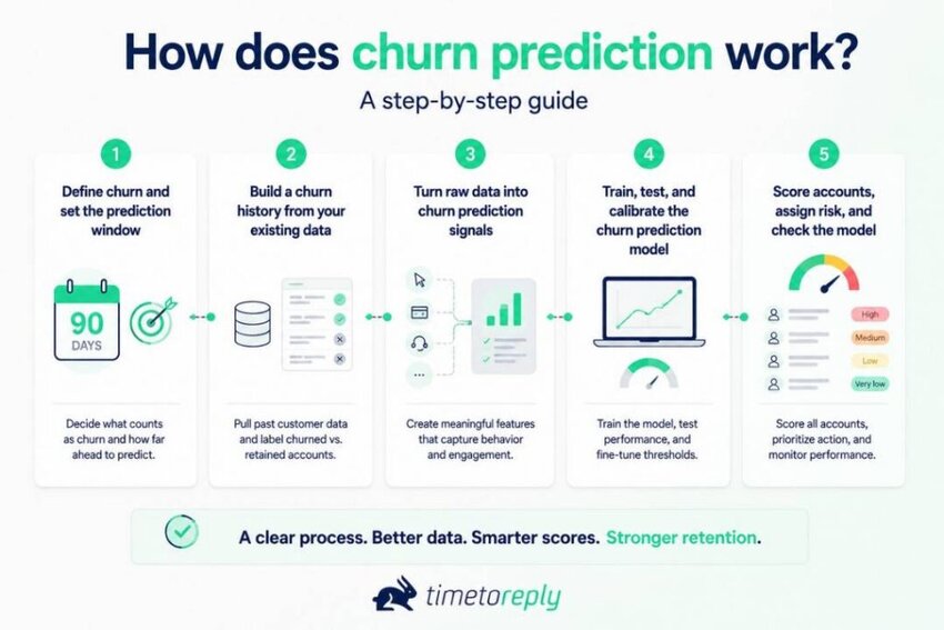
Before you build a churn prediction model, you need to decide what counts as churn. That might mean a cancellation, non-renewal, downgrade below a set level, or no activity for a certain period. Write the definition down because every number in your churn prediction work depends on it.
Next, decide how far ahead you want the model to look. “Likely to churn” isn’t very useful on its own, but “likely to churn within 90 days” gives your team something to work with. Pick a window that gives them enough time to step in and help.
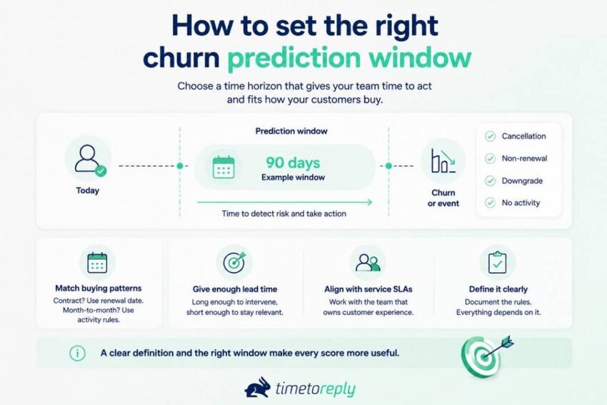
Your customers’ buying patterns should guide that choice. Contract businesses have a natural renewal date, while month-to-month products may need activity-based rules. Agree on those rules with the team that owns customer service SLAs.
Get this right before moving on to the data. It’s worth spending an hour with the people who manage customer experience every day.
You can’t predict churn without knowing what happened to customers in the past. You need a group of customers who churned and others who stayed, with their behavior recorded before the outcome. Otherwise, you’re using information from the future to predict something that already happened.
Start by checking the tools you already have. Product events, billing records, support tickets, and email analytics usually contain most of the useful signals. Use a tool like timetoreply to get detailed email data and signals that can predict at-risk accounts.
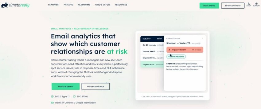
Image via timetoreply
Buying third-party data before looking through your own records can add cost without fixing the real problem.
Check for gaps before you start counting records. A field that’s only complete for enterprise accounts can bias every churn prediction score. If your team uses Google Workspace, you can also pull the service side from Gmail analytics.
Your churn prediction model can’t learn much from raw customer activity data. You need to turn those events into signals that show changes in behavior over time.
Useful examples include recent activity, rate of change, repeated events, and comparisons with an account’s usual baseline. The goal is to use signals your team could actually have seen before the customer left.
That’s important because target leakage can make a model look much better than it is. An offboarding ticket or cancellation survey gives away the outcome before the model has made its prediction.
The simple test is timing. If the feature wasn’t available on the scoring date, don’t use it.
Train the model using one period of customer data, then test it on a later period. A random split can let the model learn from future patterns, making its results look better than they really are.
You also need to calibrate the scores. If a model gives an account a 0.8 score, that should mean roughly an eight-in-ten chance of churn.
This matters because some complex models rank customers well but give unreliable probabilities. A simple, well-calibrated model can be more useful than a complex model your team can’t trust.
The final step is turning your model into a regular process. Score customers on a set schedule, then send each risk level to the right person.
Over time, the model can become less reliable. Customers change, products change, and patterns that once predicted churn may stop working.
This is known as model drift. Review performance regularly and retrain the model when its predictions start losing accuracy.
Start by deciding what counts as churn and how far ahead you want to predict it. Then use historical data to find warning signs, turn them into prediction signals, train and validate a model, and use its scores to identify customers who may be at risk.
Also Read:
The best churn signals show up before the customer decides to leave. That could mean a drop in product use, a change in billing behavior, or a decline in service performance. These signals also move at different speeds, so it helps to track all three rather than look for one magic churn metric.
Customer emails give you another layer of data. Some signals are operational, such as reply times, service targets, and workload. Others tell you more about the relationship itself, including sentiment, intent, and urgency.
Most teams already track the operational side. Average email response time is often the first metric they look at. The relationship signals tend to get much less attention, even though they can reveal that something is changing with the customer.
Here’s how the main signals break down by source and timing.
| Signal | Source | What it suggests | How early it moves |
| Login or session decline | Product analytics | The customer is getting less value from the product | Early |
| Seat or license reduction | Billing system | The customer is looking more closely at its budget | Medium |
| Late or failed payments | Billing system | The customer may be under financial strain or disengaging | Late |
| First response time creeping up | Email or helpdesk analytics | Service is getting slower for the account | Early |
| Repeated service target breaches | Email or helpdesk analytics | The team is missing promised service levels | Early |
| Reopened or escalated threads | Email or helpdesk analytics | Issues are taking more than one attempt to resolve | Medium |
In this group, three signals tend to move early, two in the middle, and one late.
That timing is a useful starting point, but don’t assume it will be the same for every business. Test it against your own data. If you already do SLA monitoring, you likely have the timestamps you need.
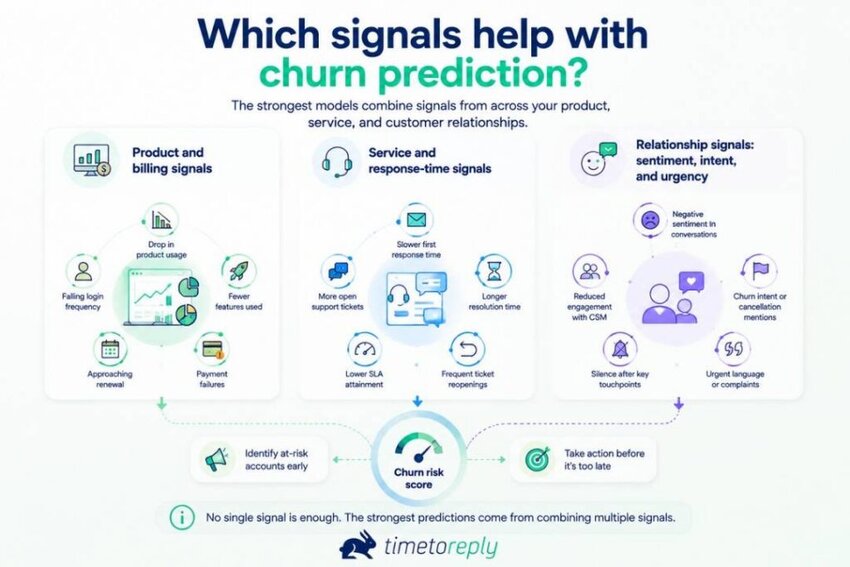
Product use and billing data are usually the first things teams look at when they start predicting churn. Login frequency, feature use, seat counts, and payment behavior can all tell you something about whether an account is at risk.
They’re also easy to pull from data you already have. So, they’re a good starting point, but they shouldn’t be the whole picture.
But don’t rely on billing data alone. It often tells you there’s a problem after the customer has already started thinking about leaving. By the time a renewal is in question, you may be playing catch-up.
Most churn models overlook service data. Reply time, first reply time, and missed service targets are usually treated as customer service metrics, not churn signals.
We reviewed eleven competing guides for this article, and none listed reply time or missed targets as inputs for a churn model. They show up in advice about keeping customers, but not in the models themselves.
That doesn’t mean these signals definitely predict churn. It means they’re worth testing. There’s no published study we found that directly measures reply speed against churn, so the evidence here is indirect.
There is some related evidence, though. Consumers say poor service experiences can make them leave, while customers report that faster replies improve their service experience.
Here are two examples from timetoreply’s clients.
None of these measures tells you that a customer will churn. We don’t have evidence to make that claim. What they do give you are signals worth adding to your model and testing against your own customer data.
Start with three measures: median first response time, the change from an account’s normal response time, and monthly service target breaches.
As a benchmark, EmailAnalytics reports an average work-hours response time of 4 hours 10 minutes across 22 industries for April to June 2026.
If you need a reliable tool to measure response times for your team, consider timetoreply. It provides detailed reply time analytics without your team members having to change the way they work.
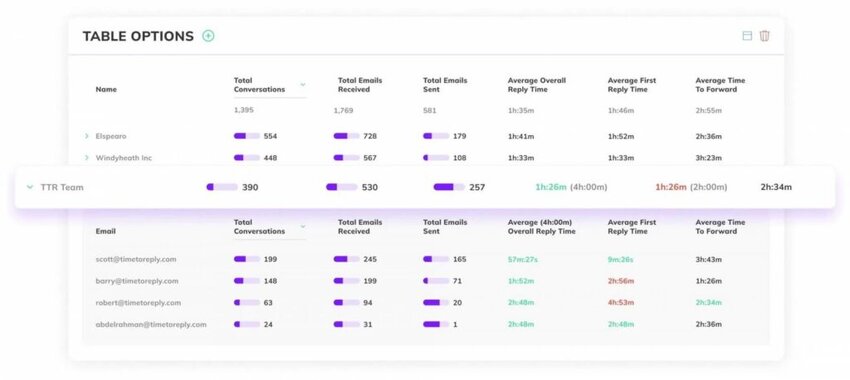
Image via timetoreply
Sentiment, intent, and urgency are some of the newest signals being considered for churn prediction. They’re still less established than the others.
They focus on what’s happening inside a customer conversation, rather than what is happening around it. Because they look at language, they can offer an early warning that you may not get from behavior alone.
At timetoreply, this layer is called Smart Data. It’s opt-in and tags emails individually. It follows the same security standards as the rest of the platform, including SOC 2 Type II, ISO 27001, HIPAA, and GDPR.
AI use in service is growing, but it is still early. Salesforce’s 2025 State of Service report states that service teams estimate AI handles 30% of cases today. Salesforce says those teams expect that number to reach 50% by 2027. That is AI across service work generally, not churn prediction specifically.
Most of these signals come from a shared inbox, where shared mailbox best practices help determine how clean the underlying data is. Good ownership rules matter more than the tooling.
Better inputs come from better habits. Using data to improve email response times is the simplest place to start. Fix that first, and the feature set gets better along with it.
The main signals come from three areas: product and billing, service performance, and customer conversations. The key is to find which ones move early enough to give your team time to act.
Also Read:
There’s no single churn prediction model that works best for every business. The right choice depends on your data, how much history you have, and how much you need to explain each prediction. Logistic regression, decision tree, and neural network models are all good options.
If renewals matter, timing also plays a role. Start simple, then add complexity only when your data calls for it.
The five model families below cover most of the options you’ll come across. The best fit depends on what you need the model to do and which analytics use cases matter to your service team.
| Model | Family | Best when | Main limitation |
| Logistic regression | Single model | You must explain every driver | Misses complex interactions |
| Decision tree | Single model | You want a readable rule set | Overfits badly on its own |
| Random forest and gradient boosting | Ensembles built from decision trees | You want accuracy on tabular data | Harder to explain, needs tuning |
| Survival models | Time-to-event methods | Many customers have not churned yet | More setup, less familiar to teams |
| Neural networks | Deep learning | Data is very large and unstructured | Usually loses to boosted trees here |
Three questions can help you narrow down the right model.
Before you choose a churn prediction model, let’s look at the problems most models still need to solve.
A 2025 systematic review from MDPI’s Machine Learning and Knowledge Extraction is helpful here. The authors reviewed 837 articles, with 240 used for bibliometric analysis and 61 examined in depth.
They called out four open problems: “class imbalance, interpretability, concept drift, and limited use of profit-oriented metrics.” Class imbalance is simply the challenge of having relatively few churners in your data.
In other words, the algorithm isn’t the whole story. These four issues can matter more than choosing one model over another. Drift is also something you can monitor regularly, much like email productivity.
The practical path doesn’t need to be complicated. Start with logistic regression and get the pipeline working from start to finish. Then test a boosted model against it. If the team doesn’t trust your churn prediction model, it won’t improve customer satisfaction.
Here are the key types of churn prediction models.
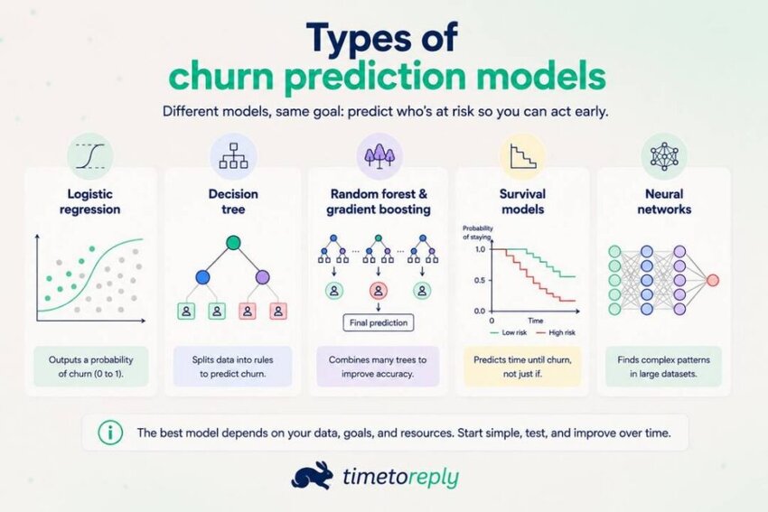
Logistic regression uses your inputs to estimate how likely a customer is to churn. It’s fast, straightforward, and a sensible place to start with churn prediction.
Each driver gets a coefficient, which makes the results easier to explain to a skeptical executive. Unless there’s a clear reason to use something else, start here.
Technically, logistic regression is a supervised machine learning algorithm. There’s no technical basis for calling it anything else.
A decision tree sorts customers into branches by applying one rule at a time. The result looks like a flowchart, so it’s easy to explain to a room. You don’t need a statistics background to follow the logic, which is unusual in churn prediction.
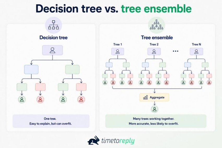
But a single tree has a big weakness: overfitting. It can memorize the training data instead of learning patterns that hold up with new customers.
Random forests and gradient boosting use many decision trees instead of relying on one. They’re not separate from decision trees; they’re built using them. The key difference is that one tree can memorize its training data, while an ensemble can reduce that problem.
Boosted trees such as XGBoost and LightGBM tend to work especially well with tabular customer data. Their inputs often come from the same systems your email analytics platforms already track.
Here’s a simple illustration of how a decision tree differs from a tree ensemble.
Survival models are built for a common churn problem: most customers are still around.
A simple classifier may mishandle customers who haven’t churned yet. Survival models instead estimate how long it might take for churn to happen. That makes them a natural fit for businesses with renewal cycles.
Those unfinished outcomes are called censored data. In other words, the customer’s outcome hasn’t happened yet. A survival model keeps that customer in the analysis rather than throwing the data away.
Neural networks are worth including, but they’re rarely the best choice for typical churn data.
For the tabular data most mid-market teams have, gradient-boosted trees usually perform better. Neural networks need more data and unstructured inputs to justify their added complexity. Most churn datasets don’t have either.
Raw conversation text is where neural networks become more interesting. They can work directly with language instead of relying on preselected features. But most churn prediction work doesn’t go that far.
Start with logistic regression if you need something simple and easy to explain. Move to boosted trees when accuracy matters more, survival models when timing matters, and neural networks only when you have enough data to justify them.
Also Read:
A churn model works when it catches meaningful churn risk, produces believable probabilities, and fits what your team can act on. That means looking beyond accuracy at precision, recall, calibration, and the prediction threshold. Accuracy alone can be misleading because churners usually make up a small share of your customers.
For example, if 20% of your customers churn and 80% stay, predicting no churn for anyone gives you 80% accuracy. You catch no churners, but the model still looks accurate on paper.
A 2025 peer-reviewed study in Scientific Reports had a similar split. Its dataset contained “20% terminated clients and 80% non-terminated clients.” The researchers used SMOTE to balance the training data. Their recommended AdaBoost model reached 84.5% accuracy and 77.1% balanced accuracy.
Recall measures the share of actual churners you flag. Precision measures the share of flagged accounts that really churn. The right trade-off depends on how many accounts your team can work.
Set your threshold accordingly. If your team can handle 20 saves each month, tune the model for the best 20 opportunities.
Finally, check calibration. If the model gives an account a 70% churn risk, that number should roughly match what happens over time. A useful churn model doesn’t just score well. It gives your team predictions they can understand and act on.
Here’s a quick illustration that you can use to check if your churn model works.
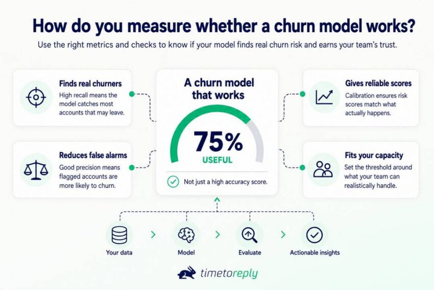
Check whether it catches actual churners, avoids too many false alarms, and produces reliable risk scores. Then set the threshold based on how many accounts your team can realistically work.
Also Read:
Turn churn prediction into action by giving every score an owner, a deadline, and a clear next step. Start with a simple workflow before investing in a bigger system. Then bring email signals into the process to catch service issues that other data may miss.
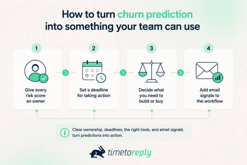
The score tells you there’s a risk. It doesn’t tell anyone who’s supposed to deal with it. Decide that part before you launch the model. Give each risk level an owner and a clear point at which they need to act.
A named account manager should get high-risk accounts within one working day. Medium-risk accounts can go into the weekly review. Low-risk accounts don’t need action unless their risk level moves up.
Don’t just flag an account and hope someone picks it up. Give the account an owner, a deadline, and a simple way to track progress. Without those basics, a high-risk account can sit in the queue for days.
Speed is something you can actually measure. Kyra Augustus, Director of Partner Support (Central) at Telarus, reported response times improving from seven hours to two in some groups. You can read the Telarus case study for more detail.
Use that same approach for churn prevention. A 48-hour first-contact target is a sensible starting point for high-risk accounts.
Don’t start by choosing a tool. First, make sure you know what counts as churn and have enough past outcomes to learn from. Someone also needs to own the model after launch. If nobody has that job, the model will eventually go stale.
You can test the idea with a simple score first. Use login decline, first response time, target breaches, and seat changes. Send the scores to the right people and see what happens. Once that process works, move to logistic regression.
That’s also the point where you can decide whether to build or buy. Buying saves time, but you give up some control over the signals. Building takes more work, but you can include service data that many vendors overlook.
Whichever route you take, email response time tracking should feed the model. Support leaders will often want the numbers by queue as well as by account. Customer service email analytics provides both.
Some of the churn signals you’re looking for are already in your inbox. Reply times, first response times, and missed service targets are all there. They’re easy to overlook because teams usually treat them as service metrics instead.
The timetoreply tool tracks those measures across Outlook, Microsoft 365, and Gmail. Its email analytics software shows the data by account, giving you another set of inputs for the churn model.
Shared inboxes are where things get complicated. One account may be handled by several people, with its email history spread across different inboxes. Shared mailbox reporting software pulls those timestamps together by account.
Give every risk score an owner and a deadline for action. Start with a simple scoring process, then decide whether you need software. Email data can add useful service signals that your other systems may miss.
Also Read:
1. What is churn prediction in simple terms?
Churn prediction is a way to spot customers who might leave before they do. The model learns from past churners and looks for similar patterns in your current customer base.
It usually gives each customer a score between zero and one. It can also show the signals behind that score, so you know which accounts deserve attention first.
2. How is customer churn calculated?
Take the number of customers lost during the period and divide it by your starting customer count. Multiply by 100 to get the churn rate. Revenue churn follows the same calculation, using recurring revenue instead.
Just decide how you’ll handle customers who joined during the period. Your choice affects the result, so include the formula whenever you publish the number.
3. What does a 20% churn rate actually mean?
A 20% churn rate means 20 out of every 100 customers left during the period you’re measuring. If you’re looking at a year, that means you’re losing a fifth of your customer base annually just to stay level.
The number tells you how many customers left, but not who they were or why they left. That’s where churn prediction and churn analysis give you more useful detail.
4. What is churn probability?
Churn probability is the chance that a specific customer will leave within a set period. Churn rate looks back at your whole customer base, while churn probability looks ahead at one account.
For example, a 0.78 score over 90 days means the account has a high predicted risk of leaving. That interpretation only holds if the model is properly calibrated.
5. How do you build a churn prediction model?
Start by deciding what you mean by churn and how far ahead you want to predict it. Then pull together past customer records where you already know who stayed and who left.
Look at things like product use, billing, and service history. Turn those records into features that capture recent activity and changes over time. Keep anything that happened after churn out of the data. Train on older records, test on newer ones, check the scores, and give someone responsibility for acting on them.
6. Which model is best for churn prediction?
There isn’t one answer for every business. Logistic regression is usually a good place to begin because you can see what is driving the result. Gradient boosting often does better when the data is structured, and you care more about prediction accuracy.
Survival models for churn prediction are useful when you also want to know when churn might happen. The best model is the one that works well enough and that your team will actually use.
7. How much data do you need for churn prediction?
You don’t need millions of customers. You need enough customers who actually churned for the model to spot useful patterns. A few hundred churned accounts with clean history can be enough for a simple model.
The quality of that history matters too. One complete year of matching product, billing, and service data can beat three years with missing pieces.
8. Can churn prediction tell you why a customer is at risk?
It can give you clues about what’s pushing the score up during churn prediction. For example, the model might show fewer logins or several missed service targets as important signals.
Those clues aren’t the same as hearing the reason from the customer. Feature importance shows an association, not a confession. Use it to decide what to ask about, then confirm the cause directly.
9. Does churn mean the same thing as attrition?
Most of the time, yes. Both can describe customers who stop doing business with you. Churn is simply the term used more often by subscription and software companies.
Attrition is more common in finance, insurance, and workforce discussions. It can also refer to employees leaving. Since neither term has a fixed technical definition, say exactly how you’re using it before you report a number.
10. How accurate does a churn prediction model need to be?
It depends on what happens after the model makes a prediction. Start with your current results, then check how many churners the model catches and how many accounts it flags unnecessarily.
If it catches 60% of churners and your team can work through the alerts, that’s a decent result. Don’t worry about beating an accuracy number from someone else’s dataset.
The goal of churn prediction isn’t to build the most impressive model. It’s to spot customers who need attention early enough for your team to do something about it. Start with the data you have, keep the model simple, and see whether it catches customers who actually leave.
Your email data deserves a place in that process. Reply times, first response times, and missed service targets can show changes in the customer relationship before they’re obvious elsewhere. Try adding them to your next churn prediction model.
Then make sure someone acts on the results. A named person reviewing the risk list each week will do more for retention than another round of model tuning. The prediction only matters once it changes what your team does.
If your team uses shared inboxes, book a demo for timetoreply to analyze your reply-time data.
Get live inbox alerts and reply quickly to customer emails with timetoreply

CEO @ timetoreply
Howard Moodycliffe is CEO of timetoreply, an email analytics & relationship intelligence platform for B2B customer-facing teams. He writes about email performance, SLA management, and how organisations can use communication data to protect customer relationships and revenue.



Trusted by high-performing inbound sales teams and customer-facing teams globally.
Close more deals and delight more customers with the faster, smarter, deeper email analytics and performance optimization software that works straight from your team’s inbox.